EHAWK - Portal Tour
General Navigation
The E-HAWK Vetting service provides real-time reputation and risk analysis. The Vetting API is used to call the vetting service during sign-up, account updates, logins, or other user interactions. Please follow this guide for implementation instructions.
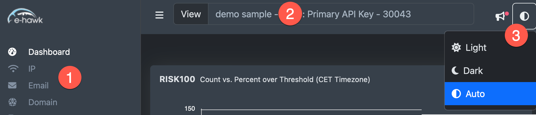
1 Main Menu Click on a menu item view that area in the portal.
2 View Select View select to select a specific API key or Rollup view.
3 Dark/Light Mode Select theme color or auto to match your system setting.
Dashboard
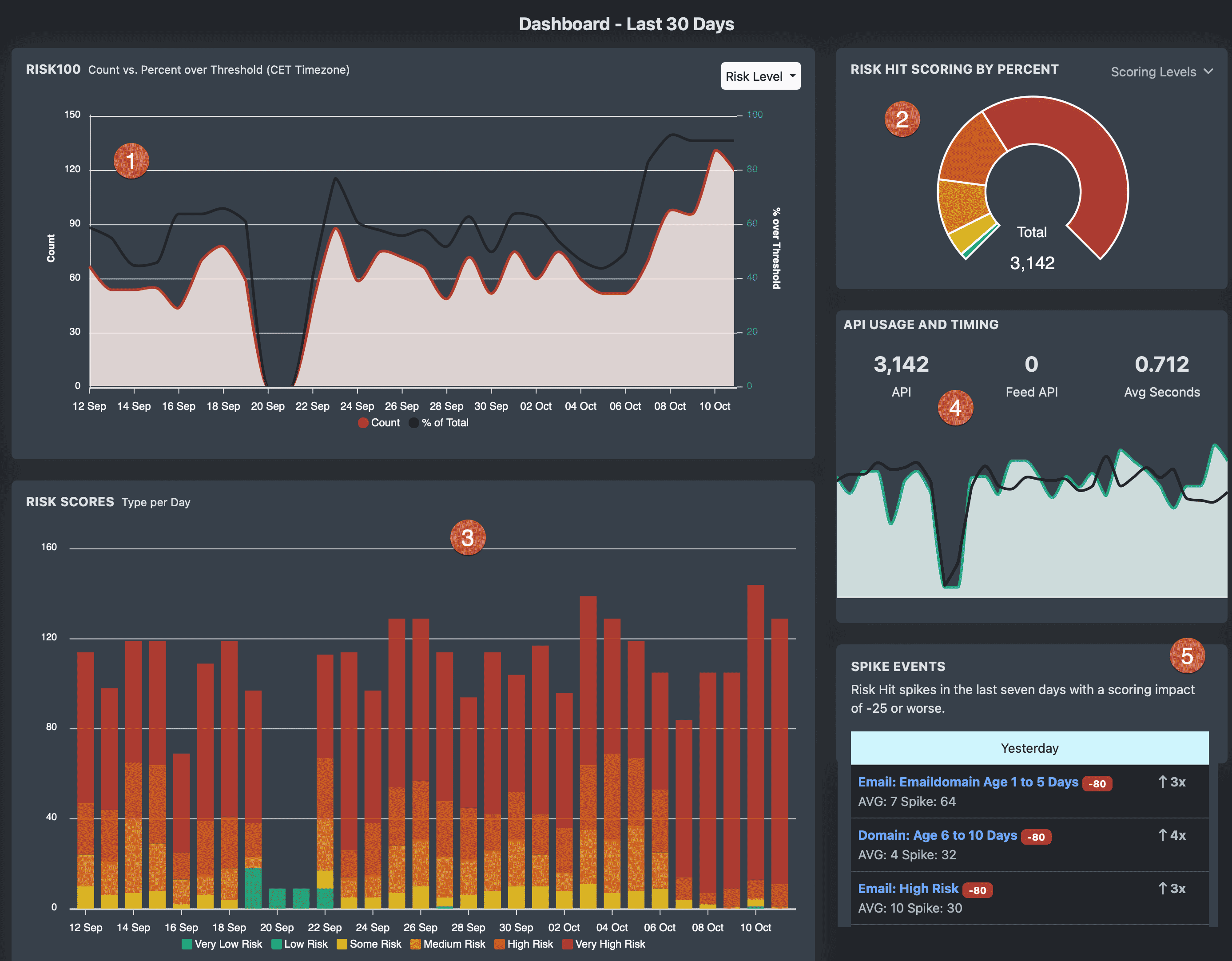
The Dashboard layout helps to quickly spot spikes in risk areas and provides click-drill-down charts to research trends and areas of concern. All charts are for thirty days of data.
1 Count vs. Percent chart shows the count by day that score worse than the Risk Level Threshold as well as the percent of total per day (black line). Change Threshold using Risk Level Select menu. Look for spikes in the percentage as this can show bot and fake sign-up attacks. Click on any day to view details.
2 Risk Hit Scoring by Percent percentages over the last 30 days. Click on a Risk Type, such as High Risk for a complete list of data.
3 Risk Scores Type by Day shows the count of risk score types per day. Click on any data point to view data.
4 API Usage and Timing Shows API and FEED-API usage per day with average time of response.
5 Spike Area Risk Hit spikes over the last week.
Area Pages
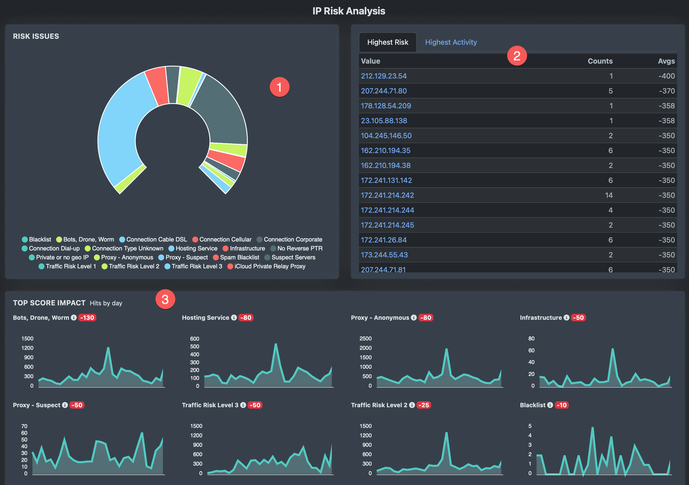
Testing areas shows risk issue donut charts, top lists, and Top Score Impact charts.
1 Risk Issue donut chart showing the count and percent of all tagged hits for the testing area. Click on any value to drill down and see data.
2 Lists of the Top 250: Tabs for both the Highest Risk items as well as the Highest Activity. Clicking on a value will show all data with the value.
3 Score Impact Charts: The portal builds the scoring impact charts based on your Custom Scoring profile. The tag hits that impact your Risk Score the most are listed in the area by weight... from Highest Negative (-5000) to Highest Positive (+5000). Each chart displays daily hits. Click on any day count and drill down to see all data that hit this scoring tag.
Reporting
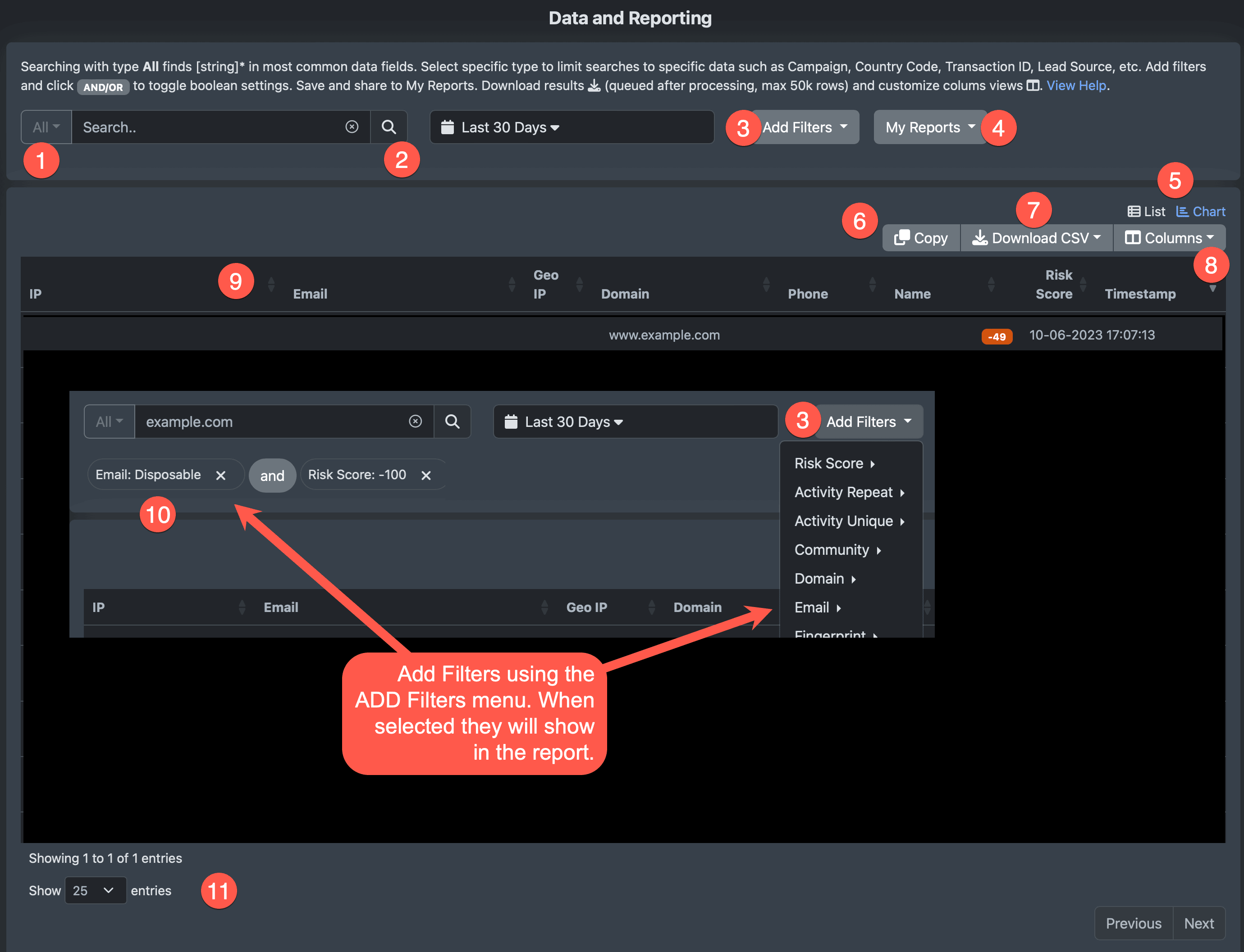
The Data page is for searching, building reports, and downloading data. Enter search and filters and then click Search button.
1 Using All, enter search text such as IP, email, domain, username, or lead source for general search. Search will be the search term + wildcard. Limit search to specific data types, such as IP or Email, by selecting type from the menu. Type search is exact match only.
2 Search button. Click to run all searches and generate reports.
3 Add filters to report. Select items from the menu and they will show below the text search box (area 10).
4 Run, manage and save new reports for quick reporting.
5 Switch between Chart View of Risk Hits, Score Impact, Grouped by Risk Level View and Data View.
6 Click to Copy filtered data to the clipboard to paste into Excel or gSheets.
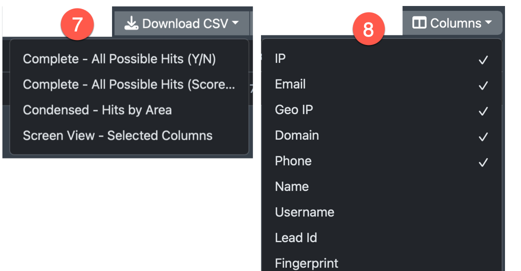
7 Download filter data (up to 50k rows) in several formats. Reports will be queued and listed for download after processing.
8 Column selector for customizing your selected shown columns.
9 Click on the up or down arrows of any column to sort.
10 Filters area listed in this area. Click on AND/OR text to toggle boolean class. Remove by clicking "x" on the filter tag. Save Report in the My Reports menu.
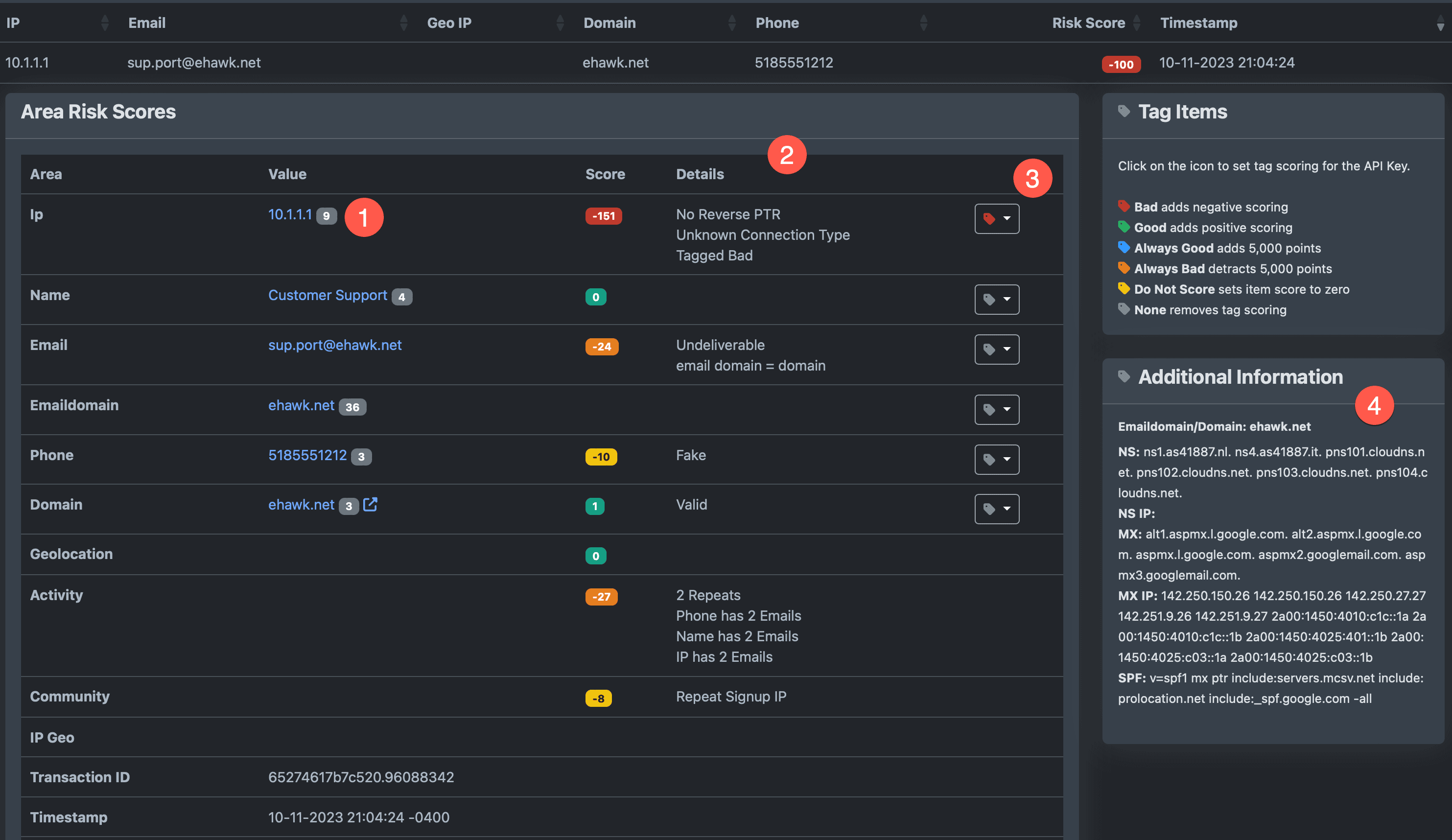
Data Details
1 Badges to the right of values show counts for the last 30 days. In this example, the IP has been seen 9 times.
2 Risk Hit Details per area.
3 Tagging select to tag items good, bad, or do not score.
4 Additional information on emaildomain, domain, and other findings.